We should give up the false belief that any image says more than a thousand words. We are so convinced that an image trumps words that we fool ourselves into believing that everyone will get what we mean, no matter what image we choose. Trust me. Nobody gets what we mean until we tell them what we mean.
Image traps
Here are three typical misconstructions I come across daily in my presentation classes at a small college in northern Germany.
1. Images can mean different things to different people

When we start talking about images I show my students this image and ask them what meaning it might have in the context of presenting? Here are some of the answers I get:
The answers may vary depending on what we talked about before. So don’t make the assumption that each member of your audience will take the same meaning from an image.
2. Images can evoke unexpected reactions
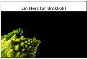
The student who used this image was trying to convince people to eat more broccoli. The headline says: “A heart for Broccoli”. The image started a discussion that the speaker hadn’t expected:
Every image carries emotions. Make sure it carries the ones you want. Cold black-and-white-and-green colors won’t help when you’re after warm and friendly.
3. What’s clear to you may not be clear to your audience
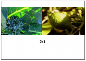
With this slide the speaker wanted to show that broccoli contains twice the amount of Vitamin C than your average lemon.
It worked, but only after a while. We needed quite a few verbal explanations.
The numbers misled us too. What would have worked faster? An image with two or three lemons? On which side? Or a bowl of real lemons? Just a sentence? A metaphor? Broccoli is like a box of vitamin pills?
Sometimes cliches work best

I usually encourage my students to think sideways and out of the box, and I must admit I am getting a little nervous when I see another pile of zen stones used to advertise another wellness business.
But as for structure and direction or the idea of highlighting the way for your audience, I find nothing works better or faster than these photos of stones that my father collected for me.
The lessons ahead for us: Don’t produce eye candy. Make your visuals mean something. Make them relevant. Make them talk or sing out loud or let them whisper. But most importantly, make them mean exactly what you want them to mean.
This article, written by Anke Troeder, originally appeared in Olivia Mitchell’s blog Speaking about Presenting. Troeder is a lecturer for public speaking at a small college in Germany. Used with permission. Anke’s blog is teachandtrain.de